
Image
The Petteys Collection of Women Artists consists of fifty works by nineteenth and twentieth century artists including Mary…
DGI Image Discovery Discovered Image

Content type
Image
Origin Information
Date Created
1923 to 1924 (year approximate)
Resource Type
DGI Image Discovery Discovered Image

Content type
Image
Origin Information
Date Created
1923 (year approximate)
Resource Type
DGI Image Discovery Discovered Image

Content type
Image
Origin Information
Date Created
1878
Resource Type
DGI Image Discovery Discovered Image

Content type
Image
Origin Information
Date Created
1890 to 1899
Resource Type
DGI Image Discovery Discovered Image

Content type
Image
Origin Information
Date Created
1987
Resource Type
DGI Image Discovery Discovered Image

Content type
Image
Description
<p>While originally Clare Leighton’s artistic interests fell primarily into the realms of painting, after attending the Central School of Arts and Crafts in London, Leighton fell into a love of wood engraving. Engraving became the medium of choice for Leighton moving forward and her mastery of the craft would lead to numerous awards and recognitions. Leighton used this medium to portray the rural culture of the time – with workers who remained true to the soil, and the rolling landscapes of the farming country they call their home. Unlike some depictions of this working class by other artists, Leighton focused on the romanticized elements of the lifestyle by choosing to show senses of community, purpose, and peace.</p>
<p>Cotton Pickers, created in 1941, portrays six workers in a field tasked with plucking the cotton. Three of the figures fall into the background of the composition, two on the left-hand side of the image, and one on the right and the remaining three figures are brought directly into the foreground of the composition. Figures are brought forward and backwards in the composition through her use of intense contrast, which also showcases what is presumably a very sunny day based on the fact the sky is left practically white. Leighton’s interest in a romanticized life of rural workers and community can be seen in the way the three figures seem to flow one into the next, almost as though they have become on cohesive unit. Their bodies move as one unit to collect the cotton and get the work done. Leighton also chooses to leave the workers’ faces ambiguous, as seen in the fact there are no details rendered in the faces at all. This choice does not allow the viewer any indication of what the worker may be feeling while they complete this work – maintaining a sense of peace. The respect of living true to the soil is emphasized through the cotton bush set in the very foreground of the piece, which mimics the stance of the workers behind it. - Erin Lascot</p>
<p>Selected Bibliography</p>
<p>Hickman, Caroline Mesrobian, "Clare Leighton's Wood Engravings of English Country Life Between the Wars." PHD. diss., University of North Carolina, 2011. ProQuest(3495493).</p>
Origin Information
Date Created
1941
Resource Type
DGI Image Discovery Discovered Image

Content type
Image
Origin Information
Date Created
1977 (year approximate)
Resource Type
DGI Image Discovery Discovered Image

DGI Image Discovery Discovered Image

Content type
Image
Origin Information
Date Created
1978
Resource Type
DGI Image Discovery Discovered Image

Content type
Image
Origin Information
Date Created
1898 (year approximate)
Resource Type
DGI Image Discovery Discovered Image

Content type
Image
Origin Information
Date Created
1974
Resource Type
DGI Image Discovery Discovered Image

Content type
Image
Origin Information
Date Created
1885
Resource Type
DGI Image Discovery Discovered Image

Content type
Image
Description
Growing up rural France gave young Rosa Bonheur inspiration to draw the domestic and farm animals around her. Bonheur showed potential early on in her artistic endeavors and received immediate support from her father – a painter in his own right – who would also become Bonheur’s mentor in her formal training. After her father passed, Bonheur was left to fend for herself, which lead to her professional development. Her innate talent garnered commercial success and public acceptance quickly, even though her personal habits as an artist were rather controversial. To better understand her animal subjects, Bonheur would visit slaughterhouses. Because women were under no circumstances allowed in these spaces, she chopped her hair short and dressed in men’s garb (which would later become her clothing of choice).
Bonheur’s engraving, "The Horse Fair," showcases her deep understanding of the subject matter she chooses to depict. The implied movement gives the viewer a sense of the organized chaos as these men lead their horses around in a circular motion to showcase their wares. The dusty atmosphere caused by circling horses is emphasized through Bonheur’s choice of engraving as her medium which gives the piece a natural graininess. Compositionally, the viewer is placed on the outside of the horse ring, calling them to action as a fellow onlooker. One horse that is just off center of the piece, to the left, is darker than the rest and is the only one rearing upwards in the composition. Adding this horse puts in an element of excitement and a visual interest that engages the viewer further into the action. Bonheur’s use of contrast emphasizes the intense muscular structure of the horses, showing of her vast understanding of their anatomy. The careful attention Bonheur makes to detail is exposed in her rendering each of the horses faces as an individual character rather than a repeat of the same. Paying such close attention to these details not only brings out the formal realism of Bonheur’s training, but provides the viewer with more emotional engagement in the scene. - Erin Lascot
Selected Bibliography
Rosa Bonheur.” The Encyclopedia of World Biography. 2nd ed. Vol. 19. Gale, 2004. Accessed March 29, 2018
Origin Information
Date Created
1900 to 1950
Resource Type
DGI Image Discovery Discovered Image

Content type
Image
Description
<p>Helen Lundeberg, a lesser-known female artist who worked in Southern California, spent the better part of six decades working primarily in acrylic paints on canvas. The bulk of Lundeberg’s works capture the ideals of the post-surrealist movement, where her subject matter – while still rooted in perception of reality -- was less autonomous and more scientific. This is reflected in her choices of color and the way she uses space as an organizing principle in her compositions. It is important to note that the colors in each of the compositions, while cool, are not cold and that keeps the general mood neutral, allowing for the viewer to form their own emotional response overtime. In both Illusions and Peaches, Lundeberg uses a muted, cool, color palette in order to render relatively simple compositions of a still life of a table setting or peaches and a paper bag, respectively. Scene of a Dream is more abstract in terms of the subject matter. Instead of being a still life, the viewer is placed in a hallway like space looking towards the vanishing point that is placed just off center, to the right. Even with a less obvious subject matter, the piece still remains neutral in regards to the colors being used.</p>
<p>Regarding space, Illusions, Peaches, and Scene of Dream are all mathematically and scientifically rendered. Her brushwork is highly precise and she arranges the objects in each piece so they balance one another so nothing feels to be more visually weighted than the other. In all of the pieces, there is a sense of illusionistic space where everything is balanced and relatively static again helping to create a neutral viewing experience. Where Lundeberg’s pieces start to unfold into a thing of brilliance is within the conscious mechanisms of the mind. It is the viewers own beliefs and emotions that begin to shift the images to be something more than just a fallen bag with peaches, or a still life on a table, or a hallway-like landscape. It is not the subject that creates the meaning, nor is it the color; rather, it is the viewer. - Erin Lascot</p>
<p>Selected Bibliography</p>
<p>Fort, Ilene Susan, ed. Helen Lundeberg: A Retrospective. Laguna Art Museum, 2016. Published in conjunction with the exhibition Helen Lundeberg: A Retrospective, Laguna Art Museum, February 21- May 30, 2016</p>
Origin Information
Date Created
1981
Resource Type
DGI Image Discovery Discovered Image

Content type
Image
Description
<p>Expatriate artist Mary Cassatt focused on modern women, exploring the private intimacy of motherhood as well as women’s expanding public role in society. Cassatt was closely affiliated with the Impressionists, exhibiting paintings with them in 1879, 1880, 1881, and 1886. Printmaking served as an extension to her painting, offering commercial opportunities and a chance to experiment with line and color.</p>
<p>In 1890 Cassatt and her friend, artist Edgar Degas, attended an exhibition of Japanese ukiyo-e prints at the Ecole des Beaux-Arts. In the Omnibus is one of a series of ten prints she made inspired by the Japanese woodblock prints. It is the only print in the series depicting women outside the home, and the only time she shows women riding public transportation. A woman with an umbrella sits next to her servant, who attends to a child on her lap. The composition is a nod to Honoré Daumier’s prints of first and third carriages carrying the denizens of Paris, but the women appear alone in the omnibus. Instead Cassatt extends the view of the landscape through the windows, encompassing the river and bridge behind them. Fine, precise lines articulate the details of their hair and clothing, and the soft palette of green, blue, and pink merge in the pattern of the servant’s hat. The moment is relaxed and informal, the women sitting easily together in anticipation of what the day will bring. – Kiki Gilderhus</p>
<p>Selected Bibliography</p>
<p>Barter, Judith A. Mary Cassatt: Modern Woman. New York: Art Institute of Chicago in association with H.N. Abrams, 1998.</p>
<p>Breeskin, Adelyn Dohme. Mary Cassatt: A Catalogue Raisonné of the Graphic Work. Washington: Smithsonian Institution Press, 1979. (2d ed., rev.). </p>
<p>Mary Cassatt: A Catalog Raisonné of the Graphic Work, 2nd Edition. Washington D.C.: Smithsonian Institution Press, 1979.</p>
Origin Information
Date Created
1891 (year approximate)
Resource Type
DGI Image Discovery Discovered Image

Content type
Image
Origin Information
Date Created
1930 (year approximate)
Resource Type
DGI Image Discovery Discovered Image

Content type
Image
Description
Elizabeth Catlett was an African-American artist whose sculpture focused primarily on the experiences of African-American and Mexican women. Through printmaking and sculpture, her work synthesized aspects of realism and modernist abstraction, narrative, and political activism. The print “My right is a future of equality with other Americans” is the culminating image of Catlett’s series The Negro Woman, which she made at the Taller de Gráfica Popular, a print shop in Mexico City known for popular and Revolutionary imagery, as well as a collective approach to printmaking. There are fifteen prints in the cycle, and each title links to form a continuous narrative:
I am the Negro woman. I have always worked hard in America…In the fields…In other folks’ homes…I have given the world my songs. In Sojourner Truth I fought for the rights of women as well as the Negroes. In Harriet Tubman I helped hundreds to freedom. In Phillis Wheatley I proved intellectual equality in the midst of slavery. My role has been important to the struggle to organize the unorganized. I have studied in ever increasing numbers. My reward has been bars between me and the rest of the land. I have special reservations…Special houses….And a special fear for my loved ones. My right is a future of equality with other Americans.
Through the series Catlett sought to depict a history of African-American women, encompassing both their triumphs and the brutal realities of slavery and the Jim Crow era. Many of the prints show women engaged in activities illustrating the titles. In contrast, the statement “My right is a future of equality with other Americans” is represented by a close-cropped, powerfully modeled woman’s head. With an energetic sense of line and patterning, Catlett’s monumental figure gazes upward in a pose of hope, strength, and achievement. – Kiki Gilderhus
Selected Bibliography
Elizabeth Catlett. Works on Paper, 1944-1992. Ed. Jeanne Ziedler. Hampton, VA: Hampton University Museum, 1993.
Herzog, Melanie. Elizabeth Catlett: An American Artist in Mexico. Seattle and London: University of Washington Press, 2000.
Lewis, Samella. The Art of Elizabeth Catlett. Claremont, CA: Hancraft Studios, 1984.
Origin Information
Date Created
1946 to 1947
Resource Type
DGI Image Discovery Discovered Image

Content type
Image
Origin Information
Resource Type
DGI Image Discovery Discovered Image

Content type
Image
Origin Information
Date Created
1881
Resource Type
DGI Image Discovery Discovered Image

Content type
Image
Description
<p>Helen Lundeberg, a lesser-known female artist who worked in Southern California, spent the better part of six decades working primarily in acrylic paints on canvas. The bulk of Lundeberg’s works capture the ideals of the post-surrealist movement, where her subject matter – while still rooted in perception of reality -- was less autonomous and more scientific. This is reflected in her choices of color and the way she uses space as an organizing principle in her compositions. It is important to note that the colors in each of the compositions, while cool, are not cold and that keeps the general mood neutral, allowing for the viewer to form their own emotional response overtime. In both Illusions and Peaches, Lundeberg uses a muted, cool, color palette in order to render relatively simple compositions of a still life of a table setting or peaches and a paper bag, respectively. Scene of a Dream is more abstract in terms of the subject matter. Instead of being a still life, the viewer is placed in a hallway like space looking towards the vanishing point that is placed just off center, to the right. Even with a less obvious subject matter, the piece still remains neutral in regards to the colors being used.</p>
<p>Regarding space, Illusions, Peaches, and Scene of Dream are all mathematically and scientifically rendered. Her brushwork is highly precise and she arranges the objects in each piece so they balance one another so nothing feels to be more visually weighted than the other. In all of the pieces, there is a sense of illusionistic space where everything is balanced and relatively static again helping to create a neutral viewing experience. Where Lundeberg’s pieces start to unfold into a thing of brilliance is within the conscious mechanisms of the mind. It is the viewers own beliefs and emotions that begin to shift the images to be something more than just a fallen bag with peaches, or a still life on a table, or a hallway-like landscape. It is not the subject that creates the meaning, nor is it the color; rather, it is the viewer. - Erin Lascot</p>
<p>Selected Bibliography</p>
<p>Fort, Ilene Susan, ed. Helen Lundeberg: A Retrospective. Laguna Art Museum, 2016. Published in conjunction with the exhibition Helen Lundeberg: A Retrospective, Laguna Art Museum, February 21- May 30, 2016</p>
Origin Information
Date Created
1977
Resource Type
DGI Image Discovery Discovered Image

Content type
Image
Origin Information
Resource Type
DGI Image Discovery Discovered Image

Content type
Image
Origin Information
Date Created
1977
Resource Type
DGI Image Discovery Discovered Image

Content type
Image
Origin Information
Date Created
1886
Resource Type
DGI Image Discovery Discovered Image

Content type
Image
Description
Helen Lundeberg, a lesser-known female artist who worked in Southern California, spent the better part of six decades working primarily in acrylic paints on canvas. The bulk of Lundeberg’s works capture the ideals of the post-surrealist movement, where her subject matter – while still rooted in perception of reality -- was less autonomous and more scientific. This is reflected in her choices of color and the way she uses space as an organizing principle in her compositions. It is important to note that the colors in each of the compositions, while cool, are not cold and that keeps the general mood neutral, allowing for the viewer to form their own emotional response overtime. In both Illusions and Peaches, Lundeberg uses a muted, cool, color palette in order to render relatively simple compositions of a still life of a table setting or peaches and a paper bag, respectively. Scene of a Dream is more abstract in terms of the subject matter. Instead of being a still life, the viewer is placed in a hallway like space looking towards the vanishing point that is placed just off center, to the right. Even with a less obvious subject matter, the piece still remains neutral in regards to the colors being used.
Regarding space, Illusions, Peaches, and Scene of Dream are all mathematically and scientifically rendered. Her brushwork is highly precise and she arranges the objects in each piece so they balance one another so nothing feels to be more visually weighted than the other. In all of the pieces, there is a sense of illusionistic space where everything is balanced and relatively static again helping to create a neutral viewing experience. Where Lundeberg’s pieces start to unfold into a thing of brilliance is within the conscious mechanisms of the mind. It is the viewers own beliefs and emotions that begin to shift the images to be something more than just a fallen bag with peaches, or a still life on a table, or a hallway-like landscape. It is not the subject that creates the meaning, nor is it the color; rather, it is the viewer. - Erin Lascot
Selected Bibliography
Fort, Ilene Susan, ed. Helen Lundeberg: A Retrospective. Laguna Art Museum, 2016. Published in conjunction with the exhibition Helen Lundeberg: A Retrospective, Laguna Art Museum, February 21- May 30, 2016
Origin Information
Date Created
1975
Resource Type
DGI Image Discovery Discovered Image

Content type
Image
Description
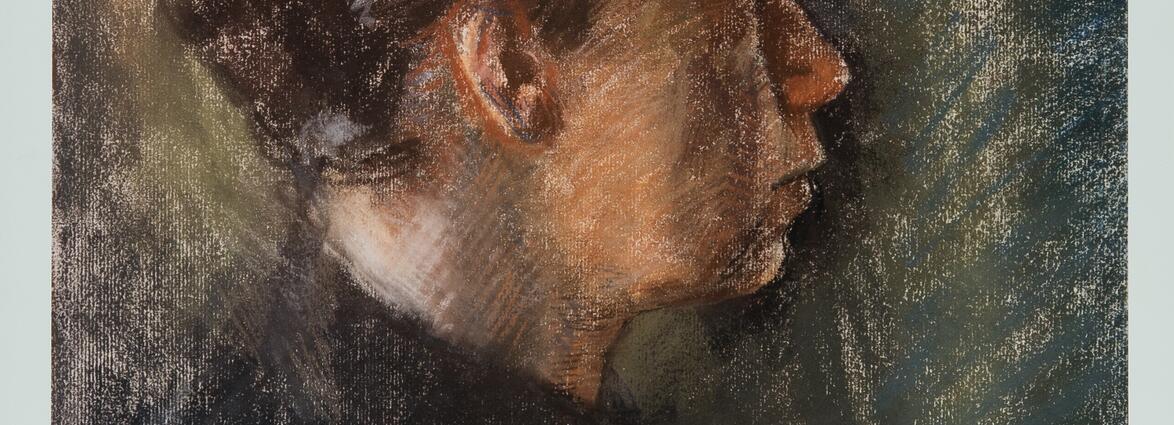
<p>Kathe Kollwitz is arguably one of the best-known women artists from the 20th century. She worked in the mediums of printmaking, drawing, painting, and some sculpture. Her works centers around the depiction of women, the working class, and periods of political and social upheaval around the times of WWI and WWII. These elements are captured most through her depictions of herself in the numerous portraits she created over the course of her career – six of which are included in the Petteys Collection of Women Artists.</p>
<p>Each variation serves as a reflection of the particular climate she found herself in at the given point in which the portrait was created. Take for example the contrast in facial expression Kollwitz captures from her etching portraits from 1912 to 1915. The face in the earlier portrait has a softness to it, where the eyes are relaxed and the mouth rests in a neutral position. The portrait from 1915 was created shortly after the death of her youngest son Peter who was killed in October of 1914. In contrast with her portrait from 1912, her expression is more jarring as the eyes look pained and the mouth has a subtle downturn to its corners creating more of a frown than in the previous image. Her later woodcut portraits, from 1923 and 1924, align with the time she was working on her “War” series in which she abandoned her previous techniques in etching and moved towards creating woodcuts which were far more minimal with expressive crosshatching.</p>
<p>Here, her portraits, while they are depictions of herself, convey a sense of heavy emotion the mothers from the war era carried – almost as the images carry a sense of visual empathy for losing one’s child. In the portrait from 1923, Kollwitz positions herself in such a way that the viewer is forced to look at her face to face. Her eyes carry a pain emphasized by the dramatic, sharp cuts created from the woodblock and the stark contrast from the solid black print and the bright white paper. The final portrait in the collection from 1933 shows a significantly aged profile of Kollwitz. By this time, Berlin as fully under Nazi regime which led to countless more turmoil including forcing Kollwitz to step down from her beloved position within the Prussian Academy of the Arts, and Kollwitz began work on her Death series – which would be the last series she would create during her career.</p>
</p>The weight Kollwitz has carried over her years is reflected as she returns to etching for this portrait, where her face falls and her posture more hunched almost as though she is truly being weighed down by the burdens she has borne. From the early portrait in this collection from 1912 to the latest from 1933, Kollwitz captures through depictions of herself how the climate around her effected not only her life, but the lives around her as well. -- Erin Lascot</p>
<p>Selected Bibilography</p>
<p>Witkovsky, Matthew S., ed. Sarah Charlesworth: Stills. Chicago: Art Institute of Chicago, 2014. Exhibition catalog.</p>
<p>Kearns, Martha, Kathe Kollwitz: Woman and Artist. (Old Westburry, NY: The Feminist Press, 1976), 133.</p>
Origin Information
Date Created
1912
Resource Type
DGI Image Discovery Discovered Image

Content type
Image
Description
<p>Kathe Kollwitz is arguably one of the best-known women artists from the 20th century. She worked in the mediums of printmaking, drawing, painting, and some sculpture. Her works centers around the depiction of women, the working class, and periods of political and social upheaval around the times of WWI and WWII. These elements are captured most through her depictions of herself in the numerous portraits she created over the course of her career – six of which are included in the Petteys Collection of Women Artists.</p>
<p>Each variation serves as a reflection of the particular climate she found herself in at the given point in which the portrait was created. Take for example the contrast in facial expression Kollwitz captures from her etching portraits from 1912 to 1915. The face in the earlier portrait has a softness to it, where the eyes are relaxed and the mouth rests in a neutral position. The portrait from 1915 was created shortly after the death of her youngest son Peter who was killed in October of 1914. In contrast with her portrait from 1912, her expression is more jarring as the eyes look pained and the mouth has a subtle downturn to its corners creating more of a frown than in the previous image. Her later woodcut portraits, from 1923 and 1924, align with the time she was working on her “War” series in which she abandoned her previous techniques in etching and moved towards creating woodcuts which were far more minimal with expressive crosshatching.</p>
<p>Here, her portraits, while they are depictions of herself, convey a sense of heavy emotion the mothers from the war era carried – almost as the images carry a sense of visual empathy for losing one’s child. In the portrait from 1923, Kollwitz positions herself in such a way that the viewer is forced to look at her face to face. Her eyes carry a pain emphasized by the dramatic, sharp cuts created from the woodblock and the stark contrast from the solid black print and the bright white paper. The final portrait in the collection from 1933 shows a significantly aged profile of Kollwitz. By this time, Berlin as fully under Nazi regime which led to countless more turmoil including forcing Kollwitz to step down from her beloved position within the Prussian Academy of the Arts, and Kollwitz began work on her Death series – which would be the last series she would create during her career.</p>
</p>The weight Kollwitz has carried over her years is reflected as she returns to etching for this portrait, where her face falls and her posture more hunched almost as though she is truly being weighed down by the burdens she has borne. From the early portrait in this collection from 1912 to the latest from 1933, Kollwitz captures through depictions of herself how the climate around her effected not only her life, but the lives around her as well. -- Erin Lascot</p>
<p>Selected Bibilography</p>
<p>Witkovsky, Matthew S., ed. Sarah Charlesworth: Stills. Chicago: Art Institute of Chicago, 2014. Exhibition catalog.</p>
<p>Kearns, Martha, Kathe Kollwitz: Woman and Artist. (Old Westburry, NY: The Feminist Press, 1976), 133.</p>
Origin Information
Date Created
1915
Resource Type
DGI Image Discovery Discovered Image

Content type
Image
Description
<p>Kathe Kollwitz is arguably one of the best-known women artists from the 20th century. She worked in the mediums of printmaking, drawing, painting, and some sculpture. Her works centers around the depiction of women, the working class, and periods of political and social upheaval around the times of WWI and WWII. These elements are captured most through her depictions of herself in the numerous portraits she created over the course of her career – six of which are included in the Petteys Collection of Women Artists.</p>
<p>Each variation serves as a reflection of the particular climate she found herself in at the given point in which the portrait was created. Take for example the contrast in facial expression Kollwitz captures from her etching portraits from 1912 to 1915. The face in the earlier portrait has a softness to it, where the eyes are relaxed and the mouth rests in a neutral position. The portrait from 1915 was created shortly after the death of her youngest son Peter who was killed in October of 1914. In contrast with her portrait from 1912, her expression is more jarring as the eyes look pained and the mouth has a subtle downturn to its corners creating more of a frown than in the previous image. Her later woodcut portraits, from 1923 and 1924, align with the time she was working on her “War” series in which she abandoned her previous techniques in etching and moved towards creating woodcuts which were far more minimal with expressive crosshatching.</p>
<p>Here, her portraits, while they are depictions of herself, convey a sense of heavy emotion the mothers from the war era carried – almost as the images carry a sense of visual empathy for losing one’s child. In the portrait from 1923, Kollwitz positions herself in such a way that the viewer is forced to look at her face to face. Her eyes carry a pain emphasized by the dramatic, sharp cuts created from the woodblock and the stark contrast from the solid black print and the bright white paper. The final portrait in the collection from 1933 shows a significantly aged profile of Kollwitz. By this time, Berlin as fully under Nazi regime which led to countless more turmoil including forcing Kollwitz to step down from her beloved position within the Prussian Academy of the Arts, and Kollwitz began work on her Death series – which would be the last series she would create during her career.</p>
</p>The weight Kollwitz has carried over her years is reflected as she returns to etching for this portrait, where her face falls and her posture more hunched almost as though she is truly being weighed down by the burdens she has borne. From the early portrait in this collection from 1912 to the latest from 1933, Kollwitz captures through depictions of herself how the climate around her effected not only her life, but the lives around her as well. -- Erin Lascot</p>
<p>Selected Bibilography</p>
<p>Witkovsky, Matthew S., ed. Sarah Charlesworth: Stills. Chicago: Art Institute of Chicago, 2014. Exhibition catalog.</p>
<p>Kearns, Martha, Kathe Kollwitz: Woman and Artist. (Old Westburry, NY: The Feminist Press, 1976), 133.</p>
Origin Information
Date Created
1923
Resource Type
DGI Image Discovery Discovered Image

Content type
Image
Description
<p>Kathe Kollwitz is arguably one of the best-known women artists from the 20th century. She worked in the mediums of printmaking, drawing, painting, and some sculpture. Her works centers around the depiction of women, the working class, and periods of political and social upheaval around the times of WWI and WWII. These elements are captured most through her depictions of herself in the numerous portraits she created over the course of her career – six of which are included in the Petteys Collection of Women Artists.</p>
<p>Each variation serves as a reflection of the particular climate she found herself in at the given point in which the portrait was created. Take for example the contrast in facial expression Kollwitz captures from her etching portraits from 1912 to 1915. The face in the earlier portrait has a softness to it, where the eyes are relaxed and the mouth rests in a neutral position. The portrait from 1915 was created shortly after the death of her youngest son Peter who was killed in October of 1914. In contrast with her portrait from 1912, her expression is more jarring as the eyes look pained and the mouth has a subtle downturn to its corners creating more of a frown than in the previous image. Her later woodcut portraits, from 1923 and 1924, align with the time she was working on her “War” series in which she abandoned her previous techniques in etching and moved towards creating woodcuts which were far more minimal with expressive crosshatching.</p>
<p>Here, her portraits, while they are depictions of herself, convey a sense of heavy emotion the mothers from the war era carried – almost as the images carry a sense of visual empathy for losing one’s child. In the portrait from 1923, Kollwitz positions herself in such a way that the viewer is forced to look at her face to face. Her eyes carry a pain emphasized by the dramatic, sharp cuts created from the woodblock and the stark contrast from the solid black print and the bright white paper. The final portrait in the collection from 1933 shows a significantly aged profile of Kollwitz. By this time, Berlin as fully under Nazi regime which led to countless more turmoil including forcing Kollwitz to step down from her beloved position within the Prussian Academy of the Arts, and Kollwitz began work on her Death series – which would be the last series she would create during her career.</p>
</p>The weight Kollwitz has carried over her years is reflected as she returns to etching for this portrait, where her face falls and her posture more hunched almost as though she is truly being weighed down by the burdens she has borne. From the early portrait in this collection from 1912 to the latest from 1933, Kollwitz captures through depictions of herself how the climate around her effected not only her life, but the lives around her as well. -- Erin Lascot</p>
<p>Selected Bibilography</p>
<p>Witkovsky, Matthew S., ed. Sarah Charlesworth: Stills. Chicago: Art Institute of Chicago, 2014. Exhibition catalog.</p>
<p>Kearns, Martha, Kathe Kollwitz: Woman and Artist. (Old Westburry, NY: The Feminist Press, 1976), 133.</p>
Origin Information
Date Created
1924
Resource Type
DGI Image Discovery Discovered Image

Content type
Image
Description
Kathe Kollwitz is arguably one of the best-known women artists from the 20th century. She worked in the mediums of printmaking, drawing, painting, and some sculpture. Her works centers around the depiction of women, the working class, and periods of political and social upheaval around the times of WWI and WWII. These elements are captured most through her depictions of herself in the numerous portraits she created over the course of her career – six of which are included in the Petteys Collection of Women Artists.
Each variation serves as a reflection of the particular climate she found herself in at the given point in which the portrait was created. Take for example the contrast in facial expression Kollwitz captures from her etching portraits from 1912 to 1915. The face in the earlier portrait has a softness to it, where the eyes are relaxed and the mouth rests in a neutral position. The portrait from 1915 was created shortly after the death of her youngest son Peter who was killed in October of 1914. In contrast with her portrait from 1912, her expression is more jarring as the eyes look pained and the mouth has a subtle downturn to its corners creating more of a frown than in the previous image. Her later woodcut portraits, from 1923 and 1924, align with the time she was working on her “War” series in which she abandoned her previous techniques in etching and moved towards creating woodcuts which were far more minimal with expressive crosshatching.
Here, her portraits, while they are depictions of herself, convey a sense of heavy emotion the mothers from the war era carried – almost as the images carry a sense of visual empathy for losing one’s child. In the portrait from 1923, Kollwitz positions herself in such a way that the viewer is forced to look at her face to face. Her eyes carry a pain emphasized by the dramatic, sharp cuts created from the woodblock and the stark contrast from the solid black print and the bright white paper. The final portrait in the collection from 1933 shows a significantly aged profile of Kollwitz. By this time, Berlin as fully under Nazi regime which led to countless more turmoil including forcing Kollwitz to step down from her beloved position within the Prussian Academy of the Arts, and Kollwitz began work on her Death series – which would be the last series she would create during her career.
The weight Kollwitz has carried over her years is reflected as she returns to etching for this portrait, where her face falls and her posture more hunched almost as though she is truly being weighed down by the burdens she has borne. From the early portrait in this collection from 1912 to the latest from 1933, Kollwitz captures through depictions of herself how the climate around her effected not only her life, but the lives around her as well. -- Erin Lascot
Selected Bibilography
Witkovsky, Matthew S., ed. Sarah Charlesworth: Stills. Chicago: Art Institute of Chicago, 2014. Exhibition catalog.
Kearns, Martha, Kathe Kollwitz: Woman and Artist. (Old Westburry, NY: The Feminist Press, 1976), 133.
Origin Information
Date Created
1927
Resource Type
DGI Image Discovery Discovered Image

Content type
Image
Description
Kathe Kollwitz is arguably one of the best-known women artists from the 20th century. She worked in the mediums of printmaking, drawing, painting, and some sculpture. Her works centers around the depiction of women, the working class, and periods of political and social upheaval around the times of WWI and WWII. These elements are captured most through her depictions of herself in the numerous portraits she created over the course of her career – six of which are included in the Petteys Collection of Women Artists.
Each variation serves as a reflection of the particular climate she found herself in at the given point in which the portrait was created. Take for example the contrast in facial expression Kollwitz captures from her etching portraits from 1912 to 1915. The face in the earlier portrait has a softness to it, where the eyes are relaxed and the mouth rests in a neutral position. The portrait from 1915 was created shortly after the death of her youngest son Peter who was killed in October of 1914. In contrast with her portrait from 1912, her expression is more jarring as the eyes look pained and the mouth has a subtle downturn to its corners creating more of a frown than in the previous image. Her later woodcut portraits, from 1923 and 1924, align with the time she was working on her “War” series in which she abandoned her previous techniques in etching and moved towards creating woodcuts which were far more minimal with expressive crosshatching.
Here, her portraits, while they are depictions of herself, convey a sense of heavy emotion the mothers from the war era carried – almost as the images carry a sense of visual empathy for losing one’s child. In the portrait from 1923, Kollwitz positions herself in such a way that the viewer is forced to look at her face to face. Her eyes carry a pain emphasized by the dramatic, sharp cuts created from the woodblock and the stark contrast from the solid black print and the bright white paper. The final portrait in the collection from 1933 shows a significantly aged profile of Kollwitz. By this time, Berlin as fully under Nazi regime which led to countless more turmoil including forcing Kollwitz to step down from her beloved position within the Prussian Academy of the Arts, and Kollwitz began work on her Death series – which would be the last series she would create during her career.
The weight Kollwitz has carried over her years is reflected as she returns to etching for this portrait, where her face falls and her posture more hunched almost as though she is truly being weighed down by the burdens she has borne. From the early portrait in this collection from 1912 to the latest from 1933, Kollwitz captures through depictions of herself how the climate around her effected not only her life, but the lives around her as well. -- Erin Lascot
Selected Bibilography
Witkovsky, Matthew S., ed. Sarah Charlesworth: Stills. Chicago: Art Institute of Chicago, 2014. Exhibition catalog.
Kearns, Martha, Kathe Kollwitz: Woman and Artist. (Old Westburry, NY: The Feminist Press, 1976), 133.
Origin Information
Date Created
1938
Resource Type
DGI Image Discovery Discovered Image

Content type
Image
Origin Information
Date Created
1941
Resource Type
DGI Image Discovery Discovered Image

Content type
Image
Origin Information
Date Created
1917
Resource Type
DGI Image Discovery Discovered Image

Content type
Image
Origin Information
Date Created
1972
Resource Type
DGI Image Discovery Discovered Image

DGI Image Discovery Discovered Image

Content type
Image
Origin Information
Date Created
1890 to 1902
Resource Type
DGI Image Discovery Discovered Image

Content type
Image
Origin Information
Resource Type
DGI Image Discovery Discovered Image

Content type
Image
Origin Information
Date Created
1989
Resource Type
DGI Image Discovery Discovered Image

Content type
Image
Origin Information
Date Created
unspecified year in 192X (year approximate)
Resource Type
DGI Image Discovery Discovered Image

Content type
Image
Origin Information
Date Created
1978 to 1979
Resource Type
DGI Image Discovery Discovered Image

Content type
Image
Origin Information
Date Created
1997
Resource Type
DGI Image Discovery Discovered Image

Content type
Image
Origin Information
Date Created
1910 to 1915 (year approximate)
Resource Type
DGI Image Discovery Discovered Image

Content type
Image
Origin Information
Date Created
1972
Resource Type
DGI Image Discovery Discovered Image

Content type
Image
Origin Information
Date Created
1966
Resource Type
DGI Image Discovery Discovered Image

Content type
Image
Description
<p>As a preeminent sculptor of the twentieth century, Louise Nevelson scavenged objects from the urban environment around her New York studio and constructed assemblages of boxes which eventually became wall-sized installations and environments. She painted these wooden assemblages matte black to more fully integrate the objects within the box environments, and more importantly, to evoke a shadowy, mysterious sense of space.</p>
<p>Tropical Leaves exemplifies the way she explored these ideas within the medium of printmaking. In this work, Nevelson etched a plate with the design, placed a thin sheet of lead on top of the plate, and ran it through a printing press. Bonding the lead to paper, Nevelson created a low relief sculpture within a two-dimensional format. Like her sculptures, the lead shares the same matte black quality, absorbing rather than reflecting light. The composition of asymmetrical and irregularly shaped boxes echoes her assemblages, and incorporates triangular shapes suggestive of the title Tropical Leaves. This long-running motif in her work originated from her travels to Mexico, the Yucatán Peninsula, and Guatemala in 1950. She described her fascination for the jungle environment and ancient Maya sculpture, particularly stelae with hieroglyphic text, as a “world of forms that at once I felt I could identify with…a world of geometry and magic.” – Kiki Gilderhus</p>
Selected Bibliography
Johnson, Una E. Louise Nevelson: Prints and Drawings 1953-1966. Brooklyn: The Brooklyn Museum, 1967.
Lisle, Laurie. Louise Nevelson A Passionate Life. New York: Summit Books, 1990.
Louise Nevelson. Ed. Bruno Corà. Milan: Skira Editore S.p.A., 2013.
Origin Information
Date Created
1972
Resource Type
DGI Image Discovery Discovered Image

Content type
Image
Origin Information
Date Created
1977 to 1980
Resource Type
DGI Image Discovery Discovered Image
 by Hannah Höch, 1963")
Content type
Image
Origin Information
Date Created
1963
Resource Type
DGI Image Discovery Discovered Image
 by Bridget Riley, 1971")
Content type
Image
Origin Information
Date Created
1971
Resource Type
DGI Image Discovery Discovered Image
 by Emma Richardson Cherry, ca. early 1890s")
Content type
Image
Origin Information
Date Created
1890 to 1895
Resource Type
DGI Image Discovery Discovered Image
 by Martha Epp, ca. 1930s or 40s")
Content type
Image
Origin Information
Date Created
1930 to 1949
Resource Type
DGI Image Discovery Discovered Image

Content type
Image
Origin Information
Date Created
1972
Resource Type